Rebranding Apollo GraphQL
Apollo GraphQL is a tech company that helps developers build apps faster through open source technology called GraphQL. Although the startup was rapidly building new partnerships, their visual branding didn’t reflect their mission. As the Lead Visual Designer, I was responsible for updating the visual language to better align with their brand goals.
My Role: Lead Visual Designer
Collaborator: Design Director
Key Stakeholders: CTO, CEO
Time Length: ongoing
Project Goals
Brand Audit
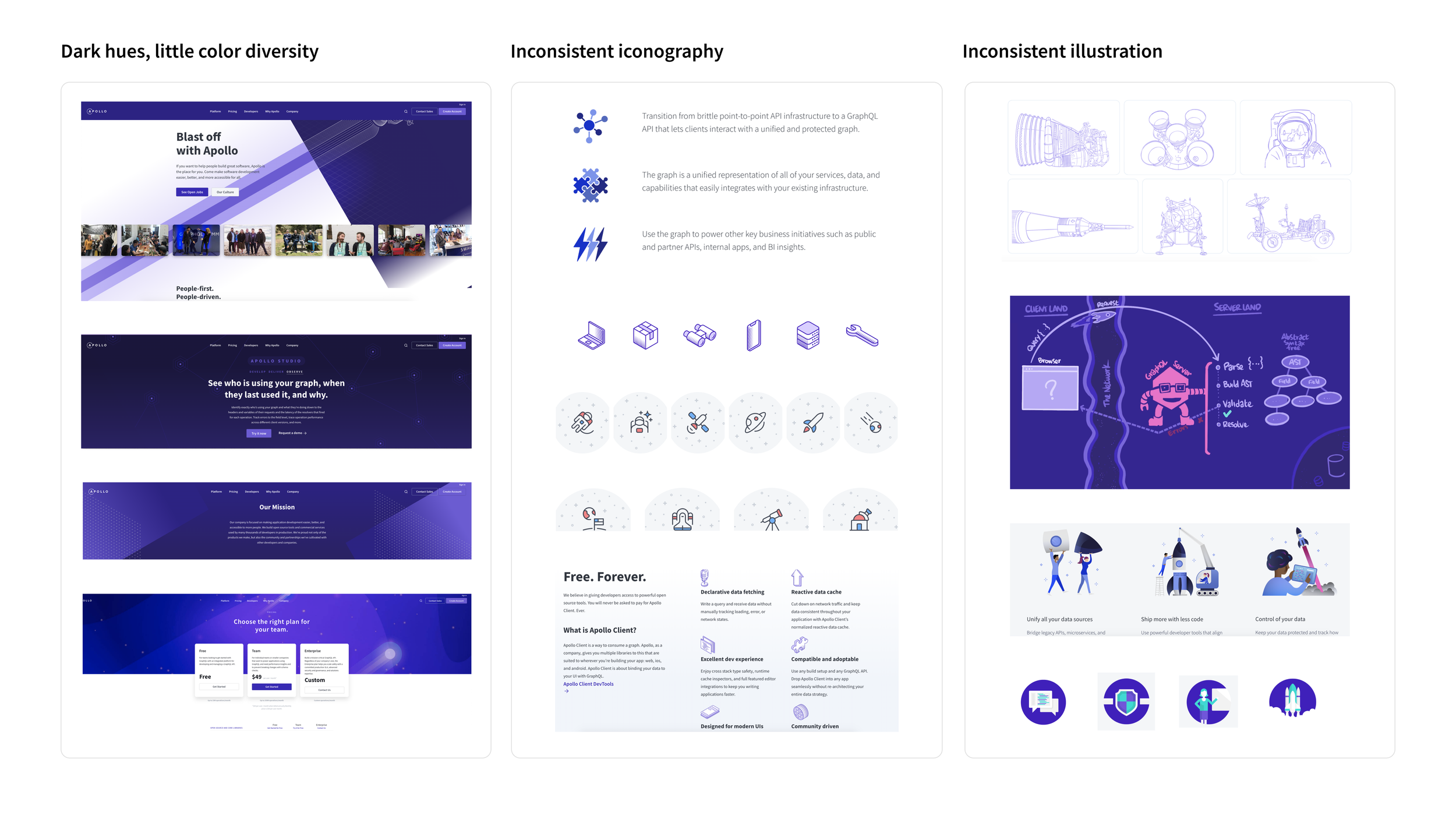
After reviewing Apollo’s website, I realized the company was missing color, illustration, and iconography guidelines. This made the brand’s visual voice inconsistent. I implemented a set of guidelines that unified Apollo’s visual brand.
Personas
I developed personas to better understand Apollo’s target audience and what motivates them.
Illustration Guidelines
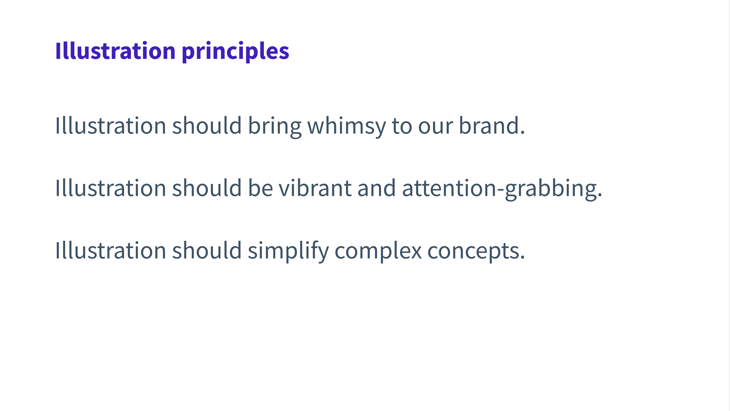
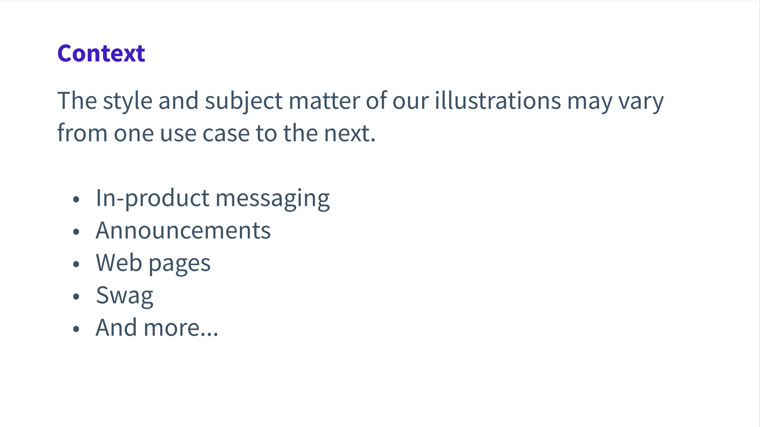
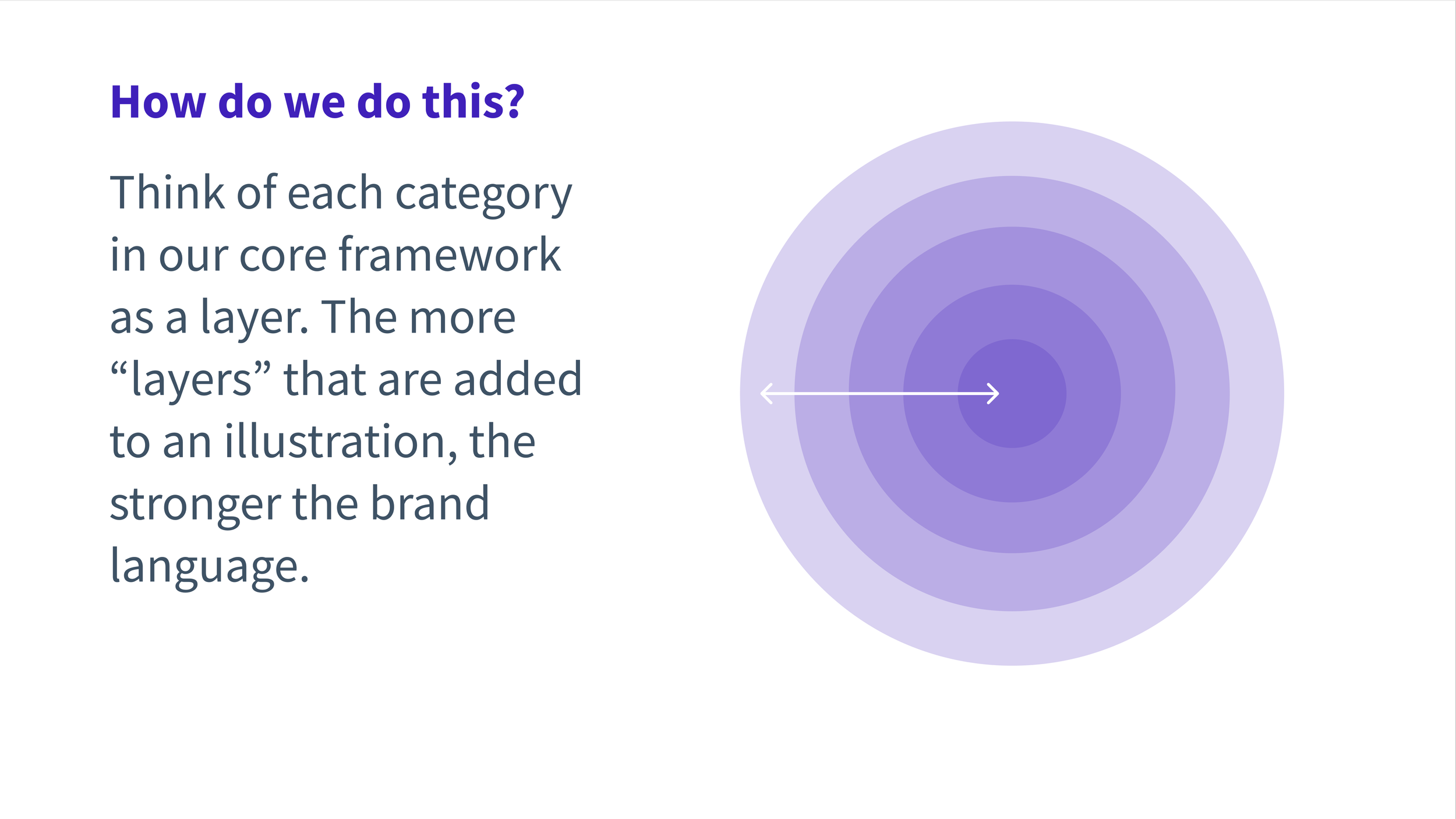
The first step in applying new brand direction was providing the Design team with clear illustration guidelines. I collaborated with the Design Director to write guidelines that provided the flexibility to create unique illustrations while still adhering to specific design parameters.
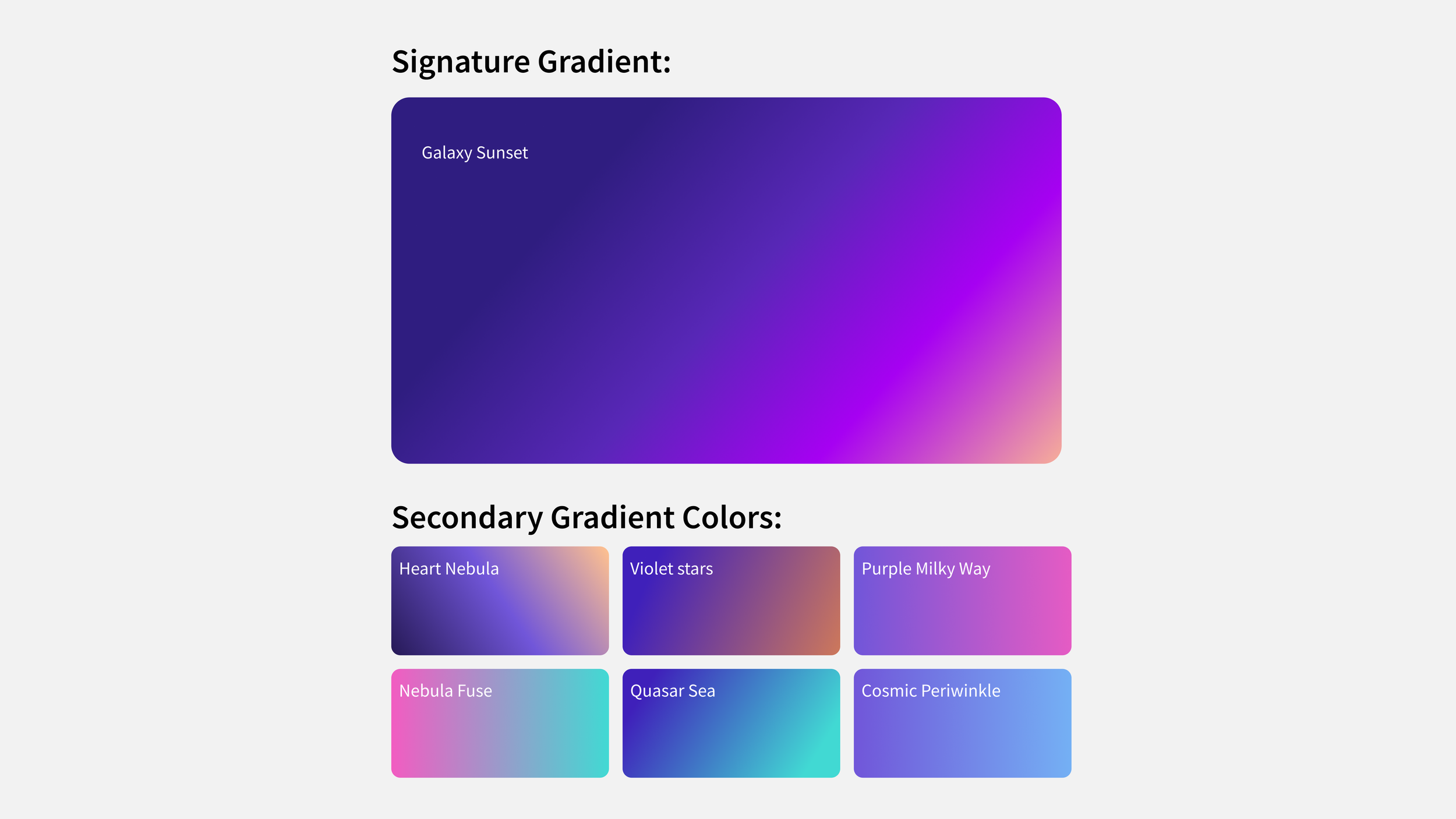
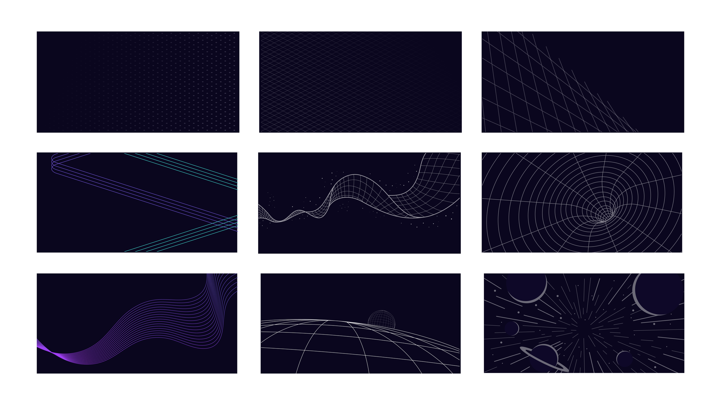
New Background Gradient Colors
Apollo was almost exclusively using dark hues and depictions of deep space in their design assets which felt cold and isolating. To align with their goal of empowering developers, I introduced a set of gradients that contained warmer and more inviting colors.
Modular Social Media Templates
I built modular design templates that all employees could use to generate social media content. It included textures, formatted copy options and illustrations that could be layered on top of gradients in a variety of combinations.
Instructional Video
Since many employees were new to Figma, I created instructions on how to use the template.
Social Media Examples
Here are some examples of the new social posts Marketing team members were able to design with the template and tutorial I designed.
Icons
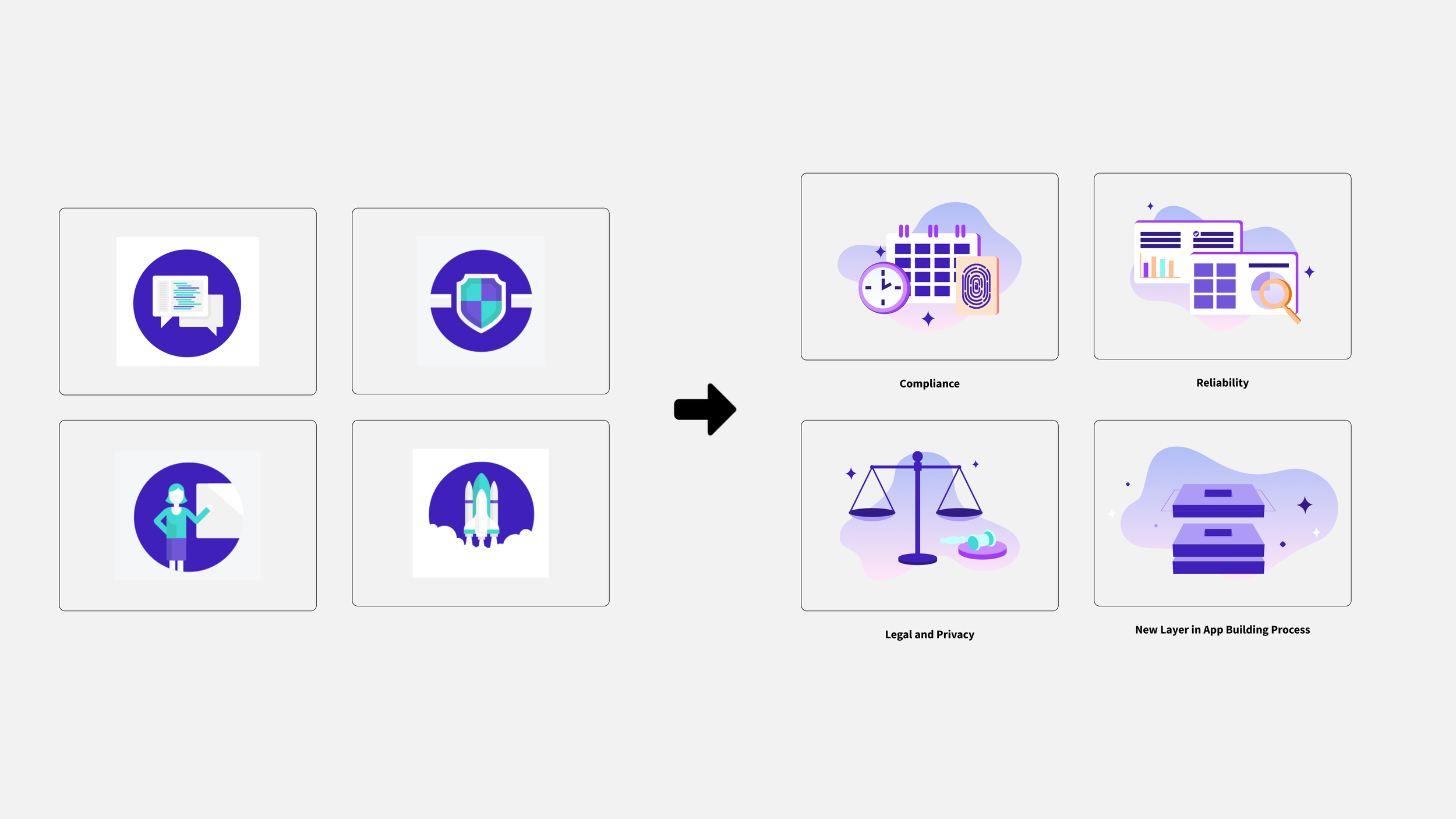
These newly branded icons use simple flat shapes that are easier to view on mobile applications and specifically align to the functionality of specific software features at Apollo.
Infographics
I introduced a new design direction for infographics that incorporated gradient backgrounds and brighter colors.
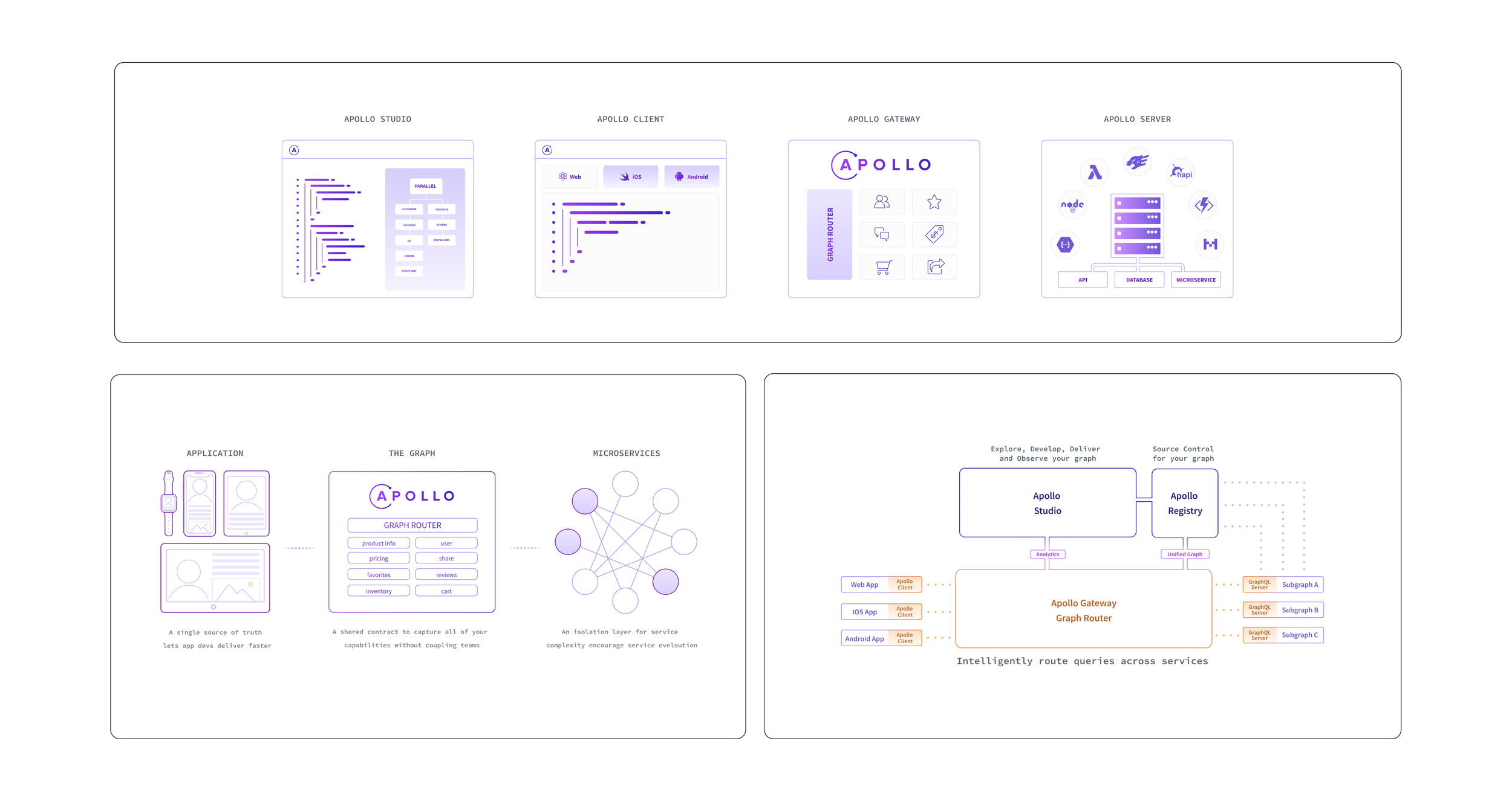
Data Visualization
I designed visual representations of the Apollo graphQL software features to help convey complex concepts.
Logos
Designers at Apollo followed the values of human centric and meaningful design highlighted in the illustration guidelines.
Badges
We updated existing employee swag with the new gradients I provided.
T-shirts
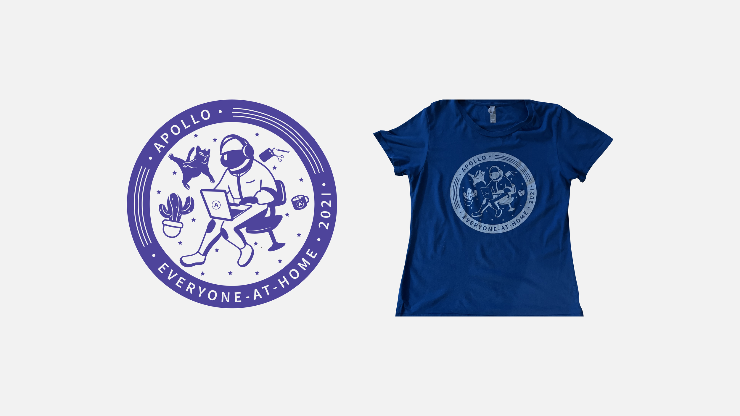
I incorporated more human-centric scenarios, like working from home, to connect with employees at Apollo. The t-shirt above was for a company-wide hackathon focused on building connections while working remotely.
Webpages
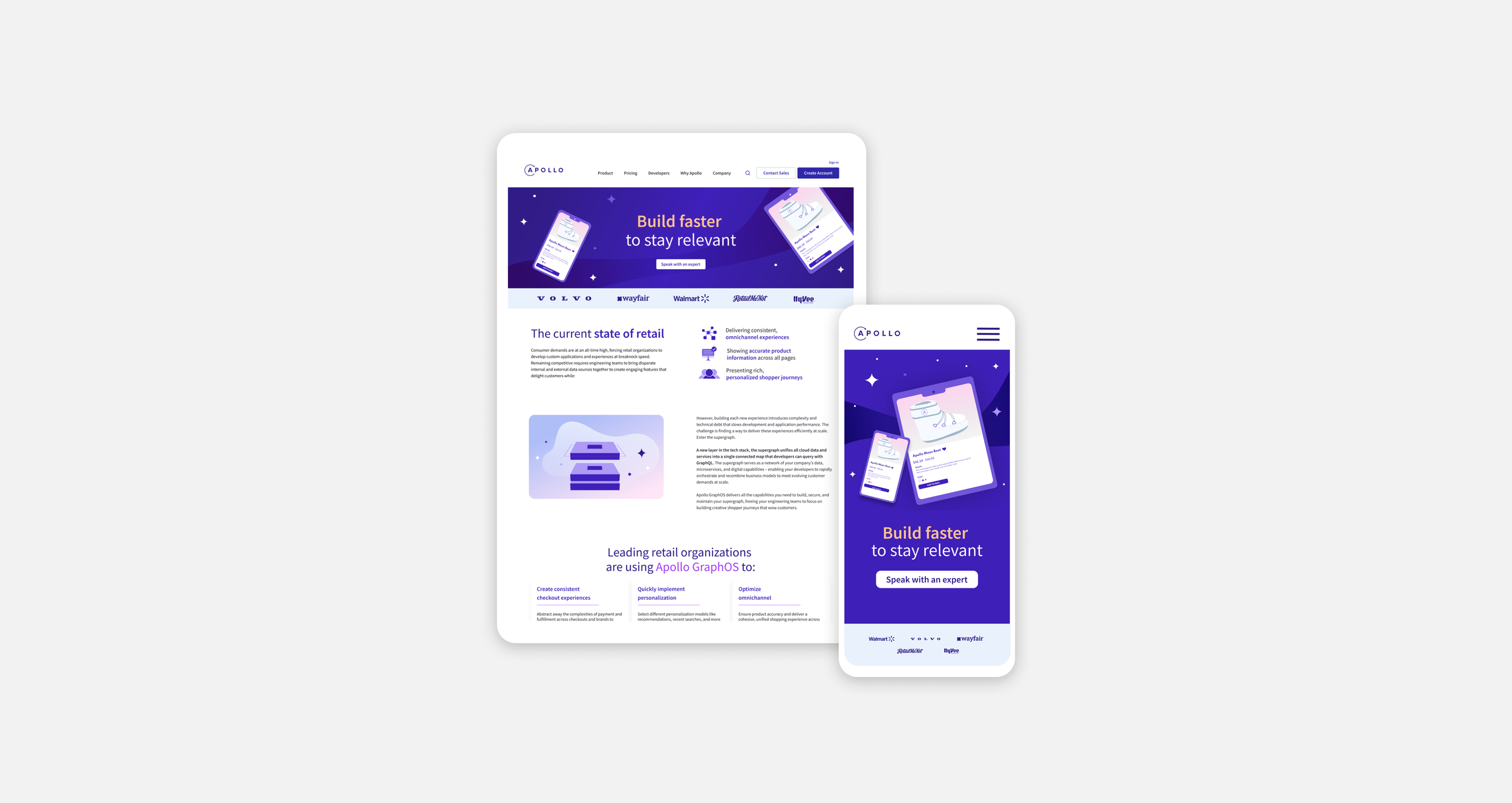
As UX/UI designer for vertical Supergraph landing page, I used new gradients, texture overlays and brighter typography.
Vertical Landing Page
I was UX/UI designer for vertical landing page. I incorporated illustrations that aligned with the new brand standards.
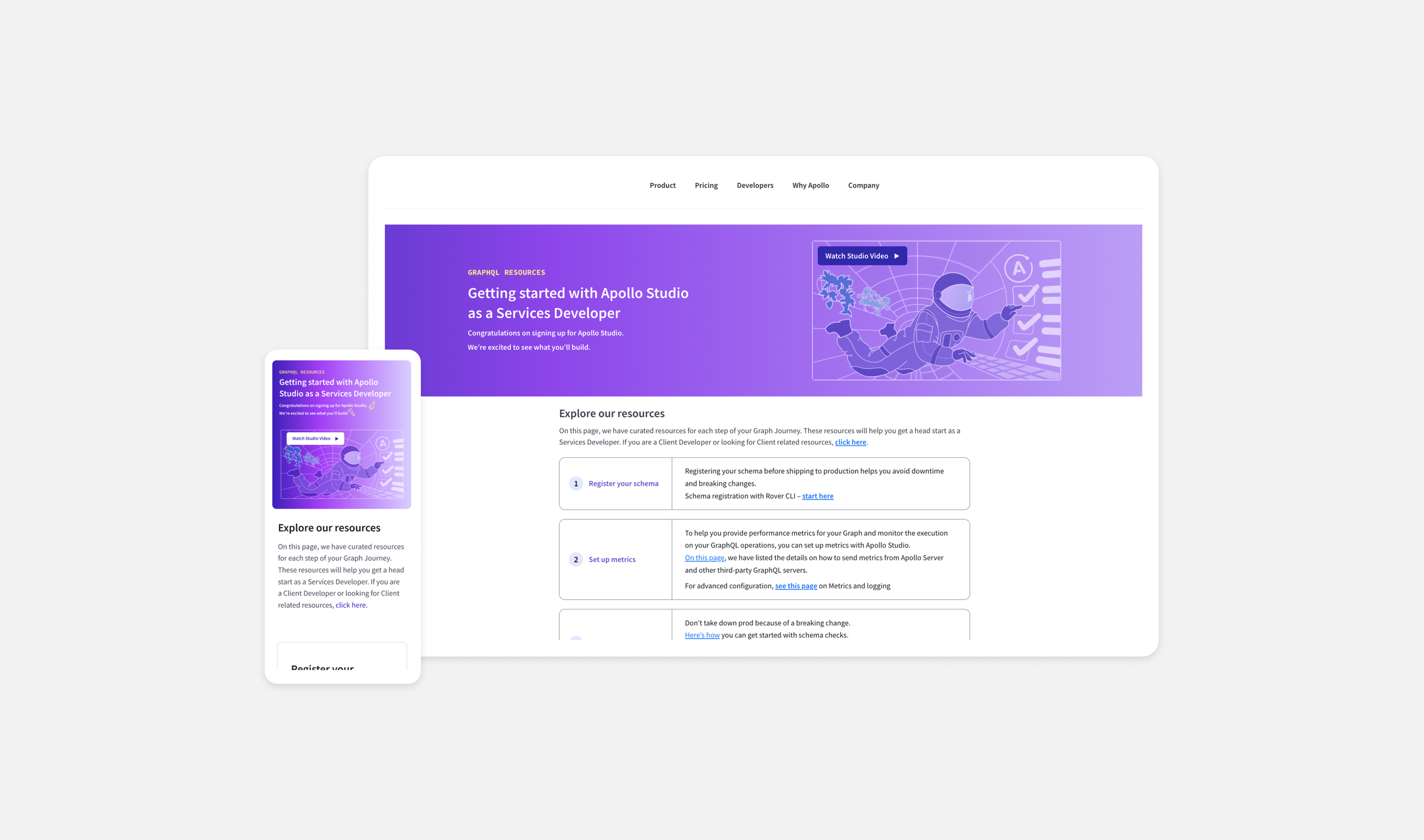
Developer Onboarding Landing Page
As the UX/UI designer for the Developer Onboarding page, I illustrated an astronaut running checks in Studio (a software feature offered at Apollo) to depict a relatable scenario while adding a whimsical theme.
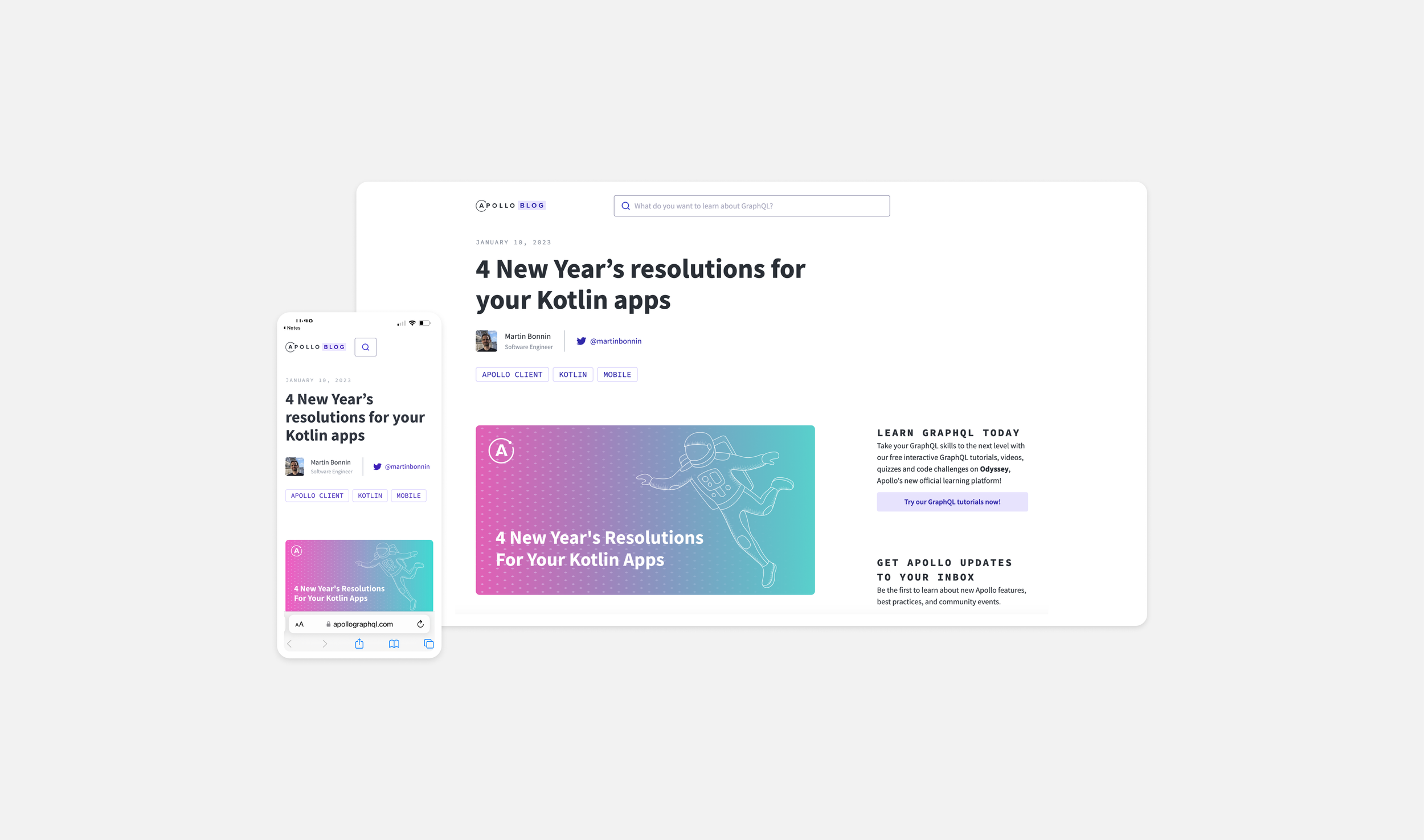
Blogposts
An example of the new branding direction being used in blog posts on Apollo’s website


